

Colours have an incredible impact on our emotions, mood, and overall well-being, and when it comes to interior design, understanding the psychology of colour can be a powerful tool. Using the knowledge successfully, you can transform your living space into a haven that reflects your desired ambiance. In this blog post, we will delve into the fascinating world of colour psychology, and explore how it can be used to create a harmonious and uplifting environment within a space.

The Basics of Colour Psychology:
Before we dive into specific colours, it is very important to grasp the fundamental principles of colour psychology. Colours can be broadly classified into warm tones (reds, oranges, yellows) and cool tones (blues, greens, purples.) Warm colours tend to evoke energy, passion, and vibrancy, while cool colours promote calmness, relaxation, and tranquillity. Additionally, each colour carries its own unique psychological associations and can elicit different emotional responses.
It is important to note that the psychological impact of colours can vary from person to person due to personal experiences and cultural influences. Ensure to consider your own preferences and the overall desired ambiance of your space when selecting colours. Experiment, trust your instincts, and create a harmonious environment that reflects your unique personality and promotes a positive emotional experience.
The Impact of Warm Colours:
Warm colours have the ability to stimulate and energise a space. Red, for instance, is often associated with passion, love, and excitement. It can be used as an accent colour to create a focal point or in spaces where social interaction and liveliness are desired, such as the dining area or entertainment room. Orange, on the other hand, radiates warmth and enthusiasm, making it an excellent choice for spaces where creativity and energy are encouraged, like living rooms, home offices or creative studios.
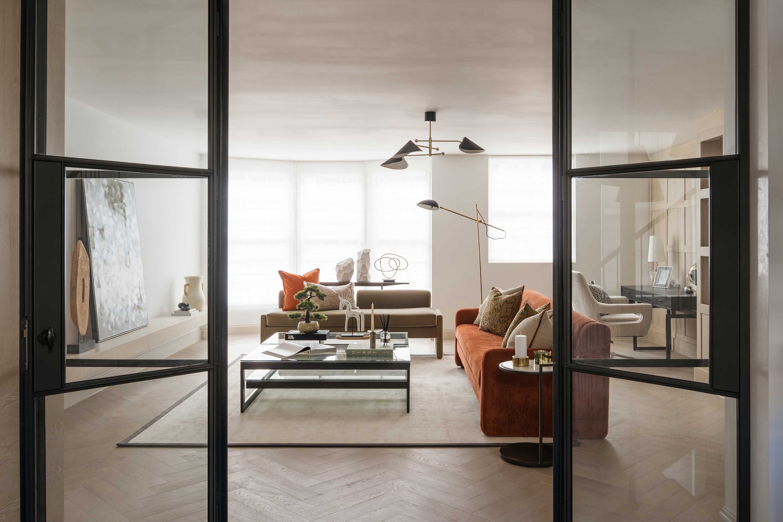
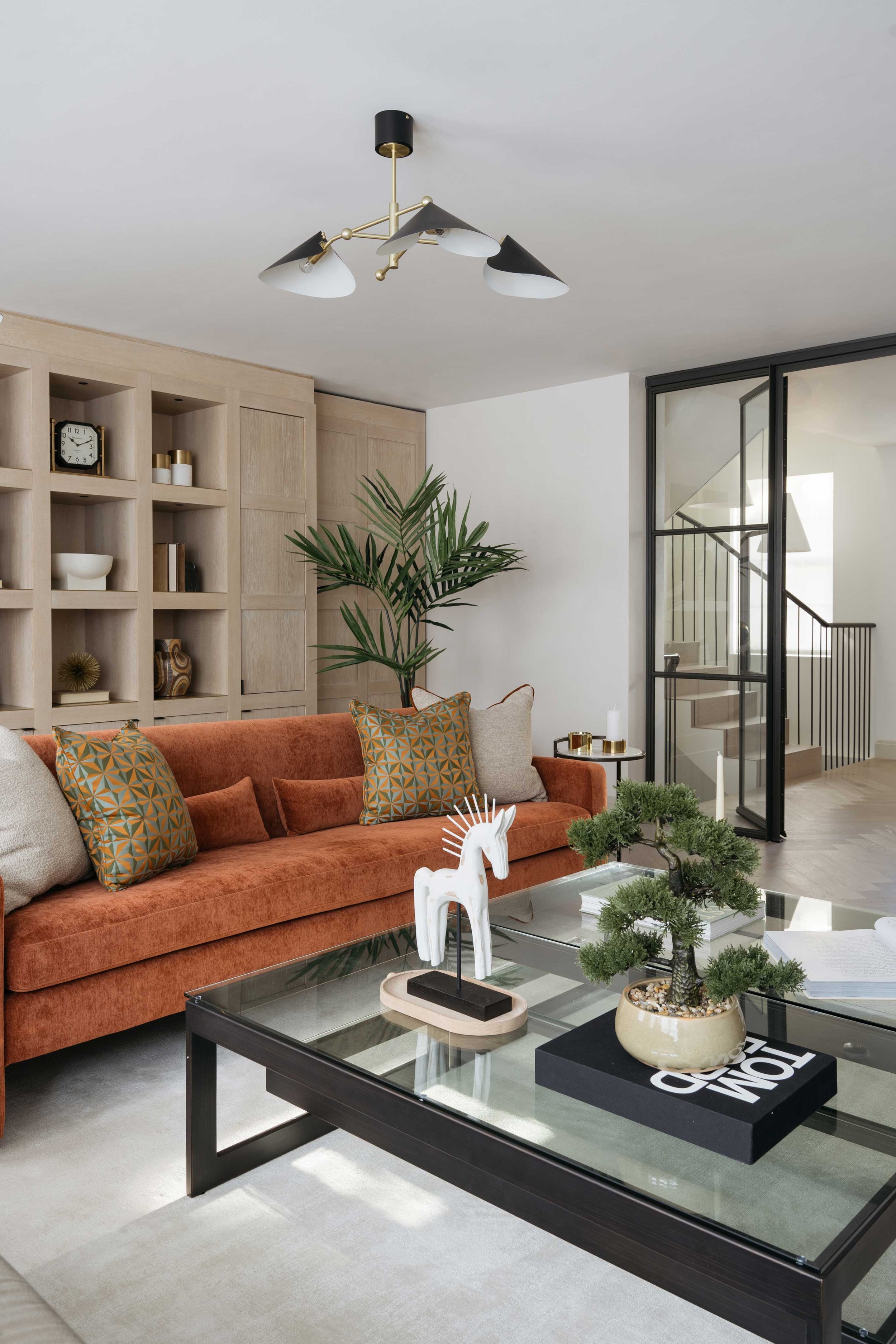
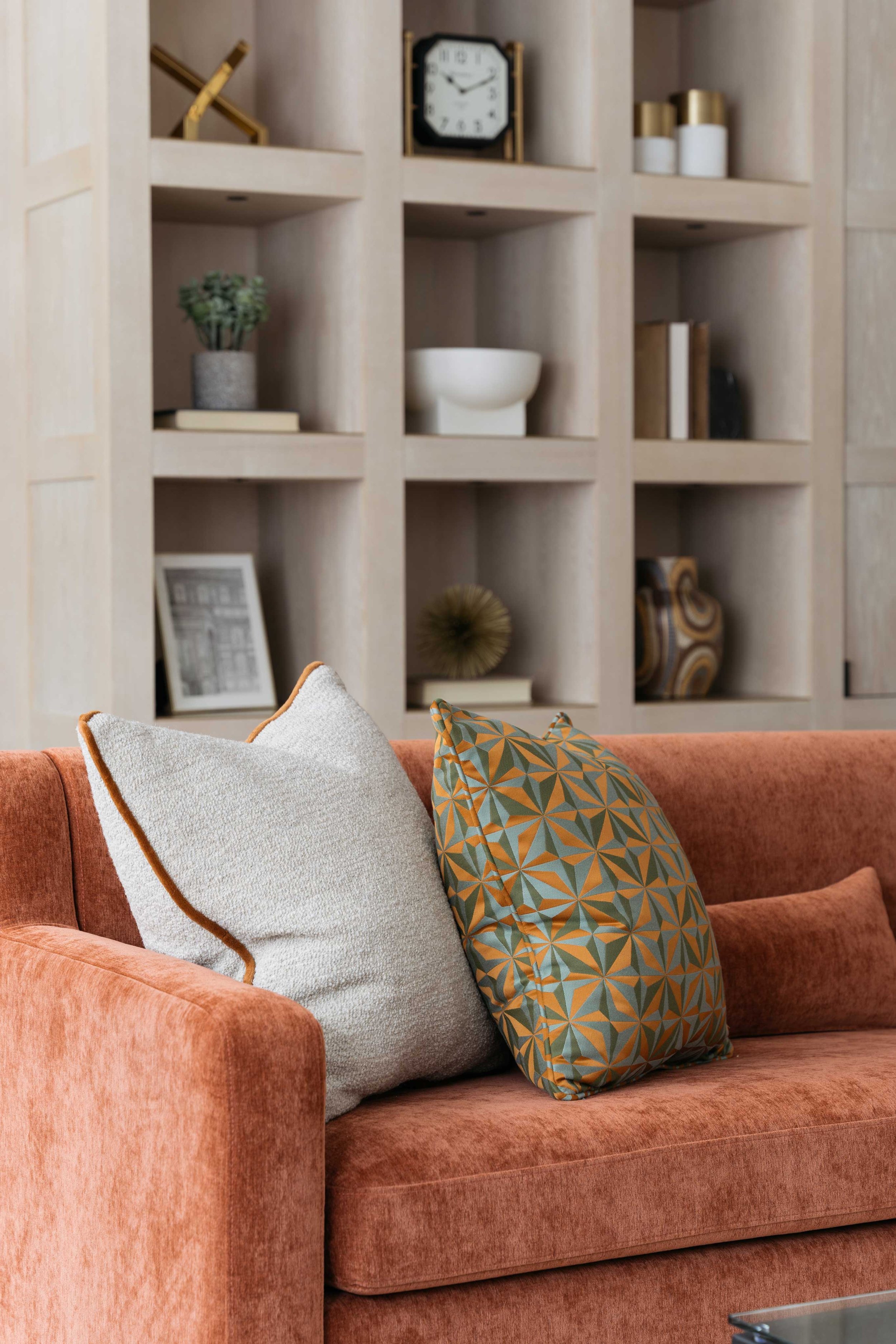
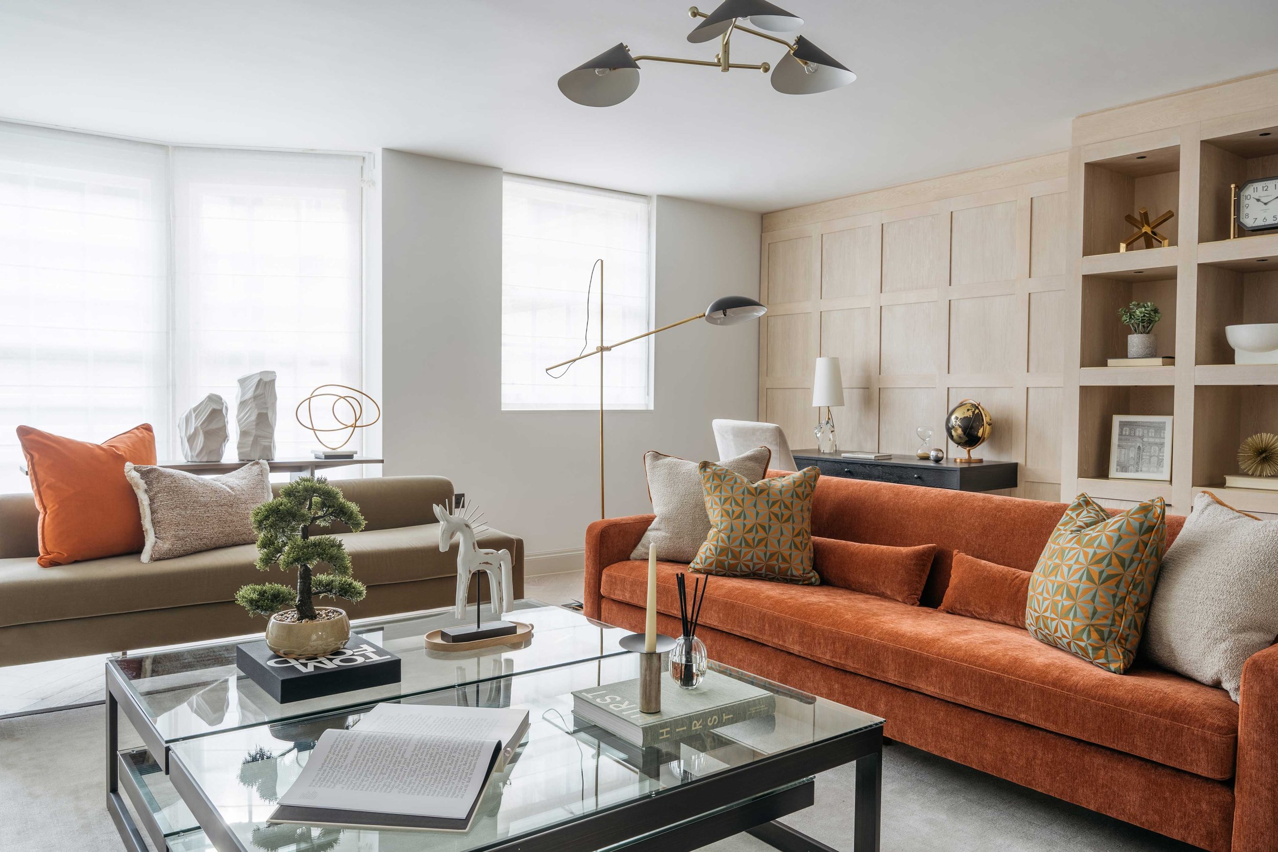
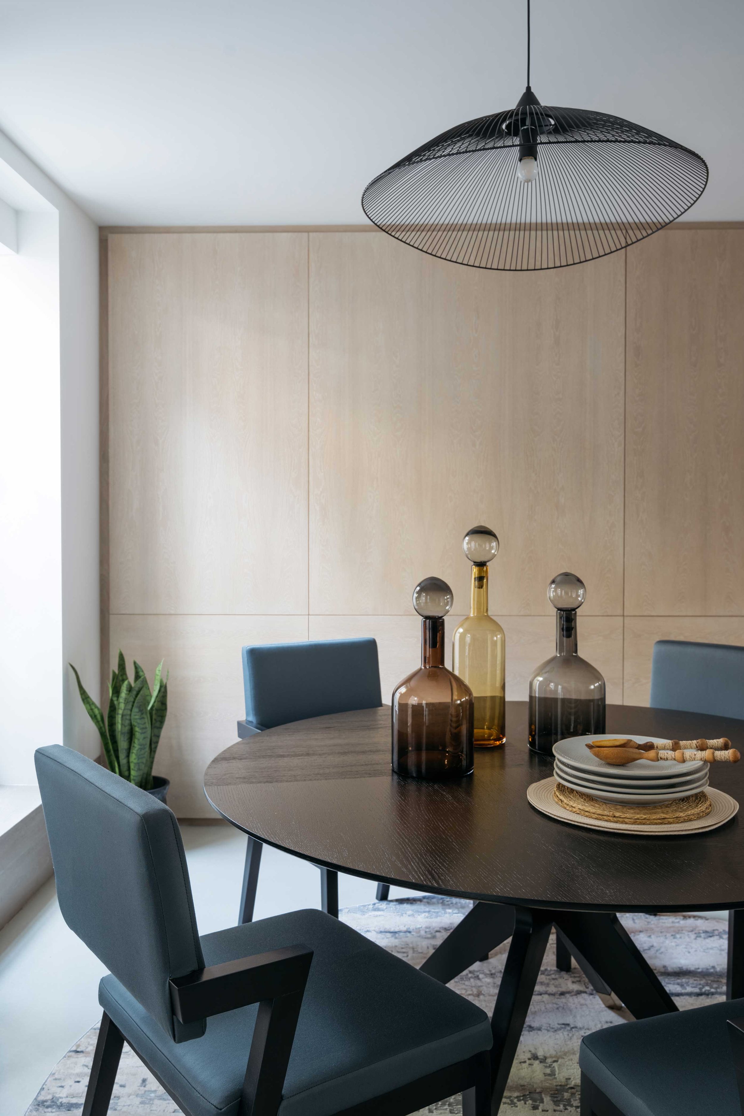
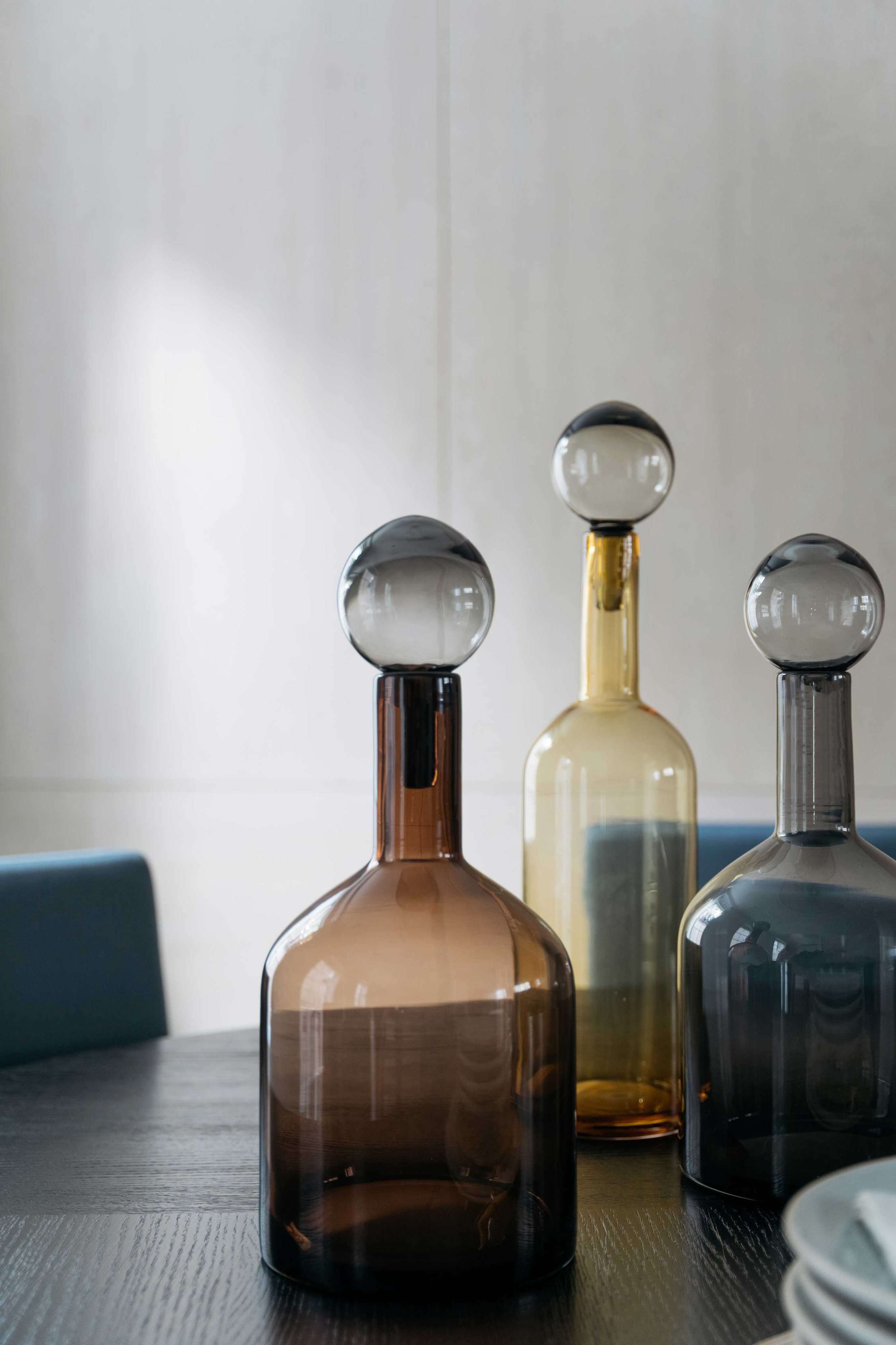
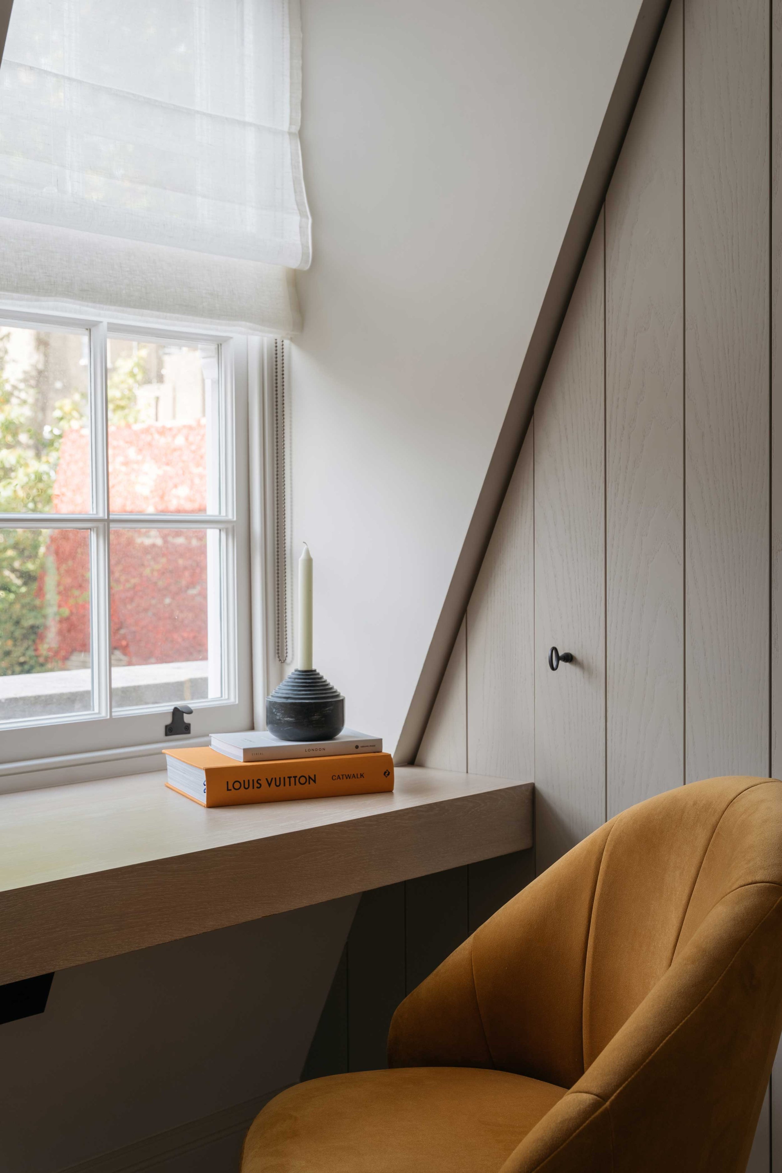
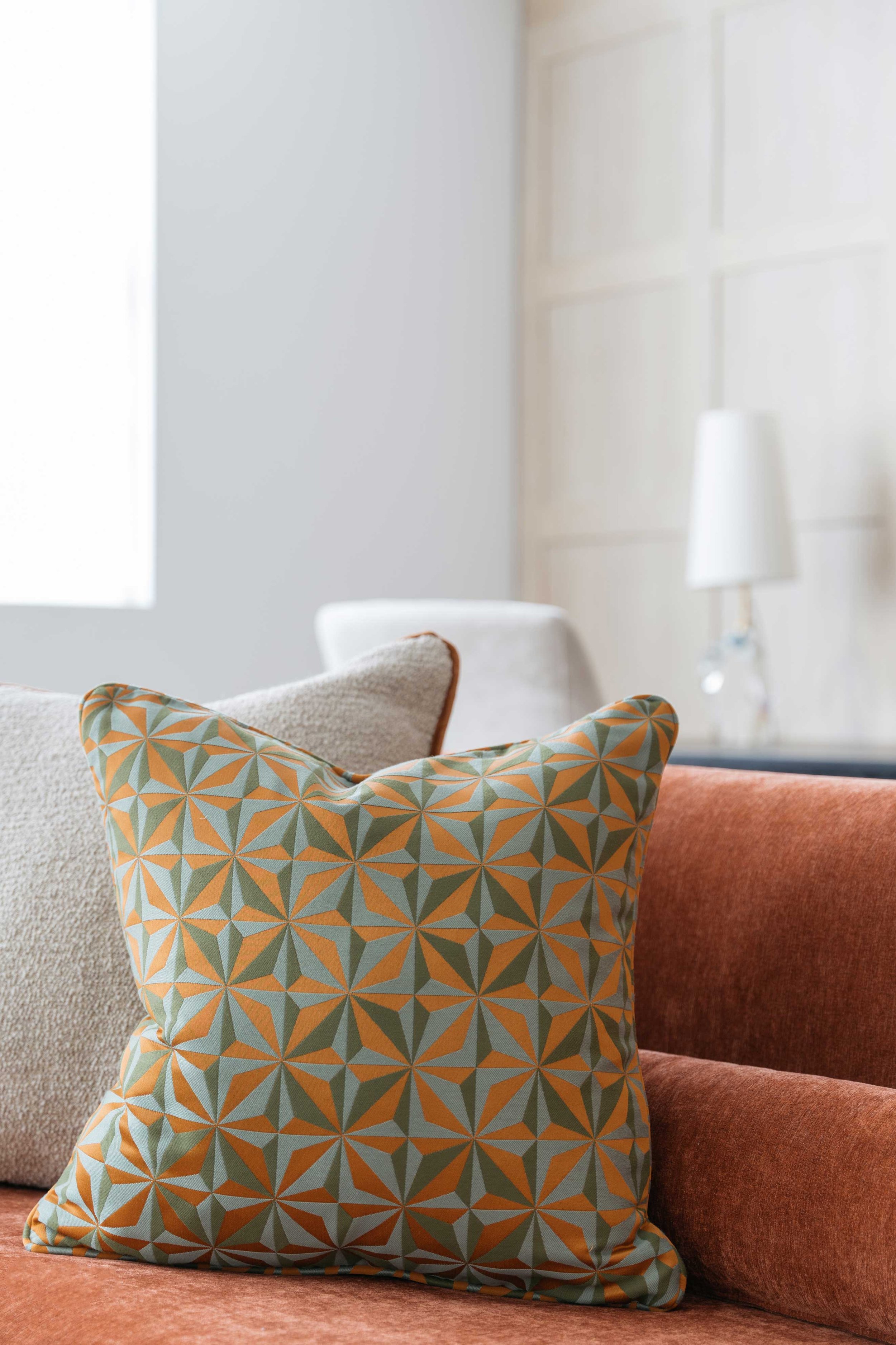
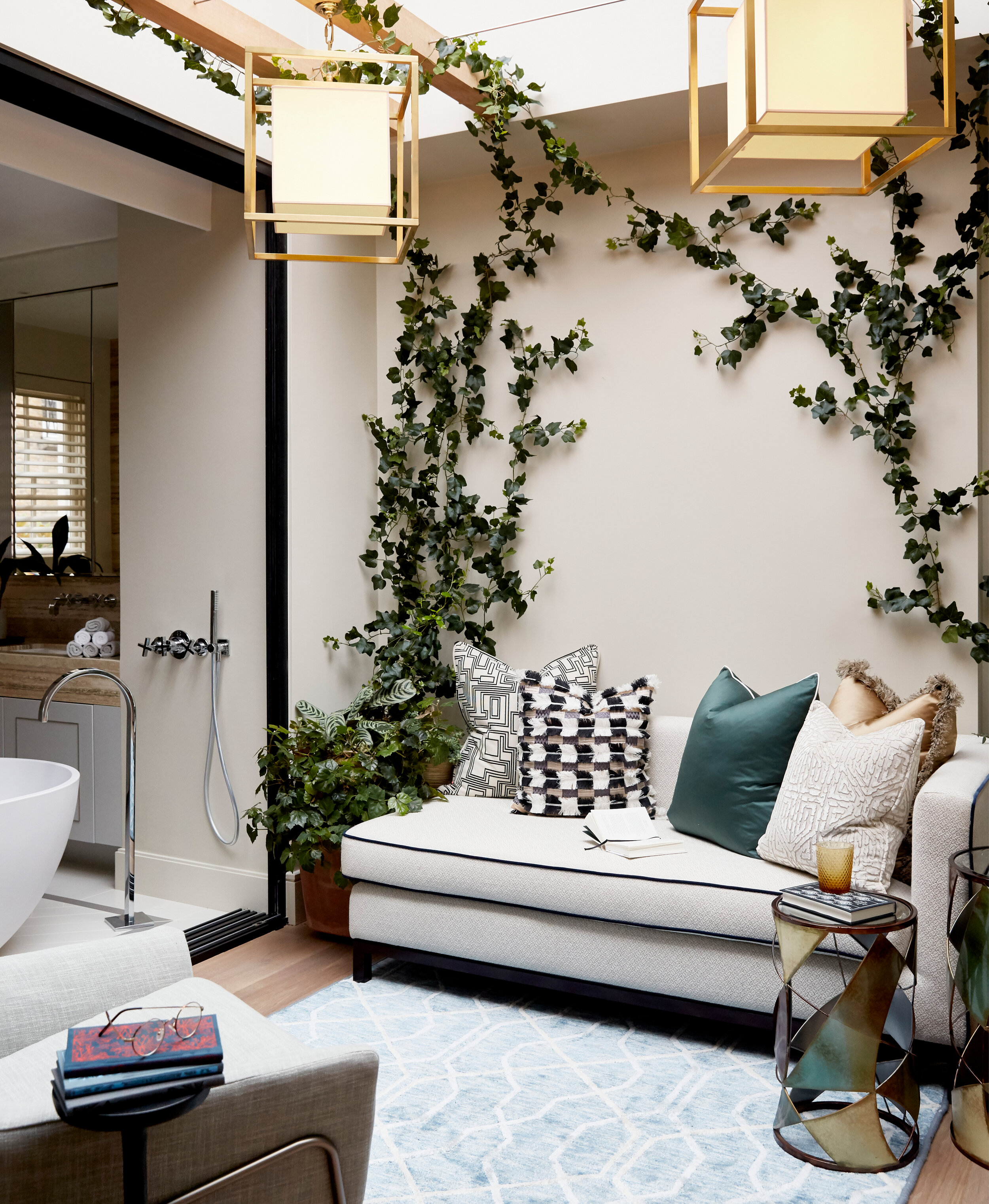
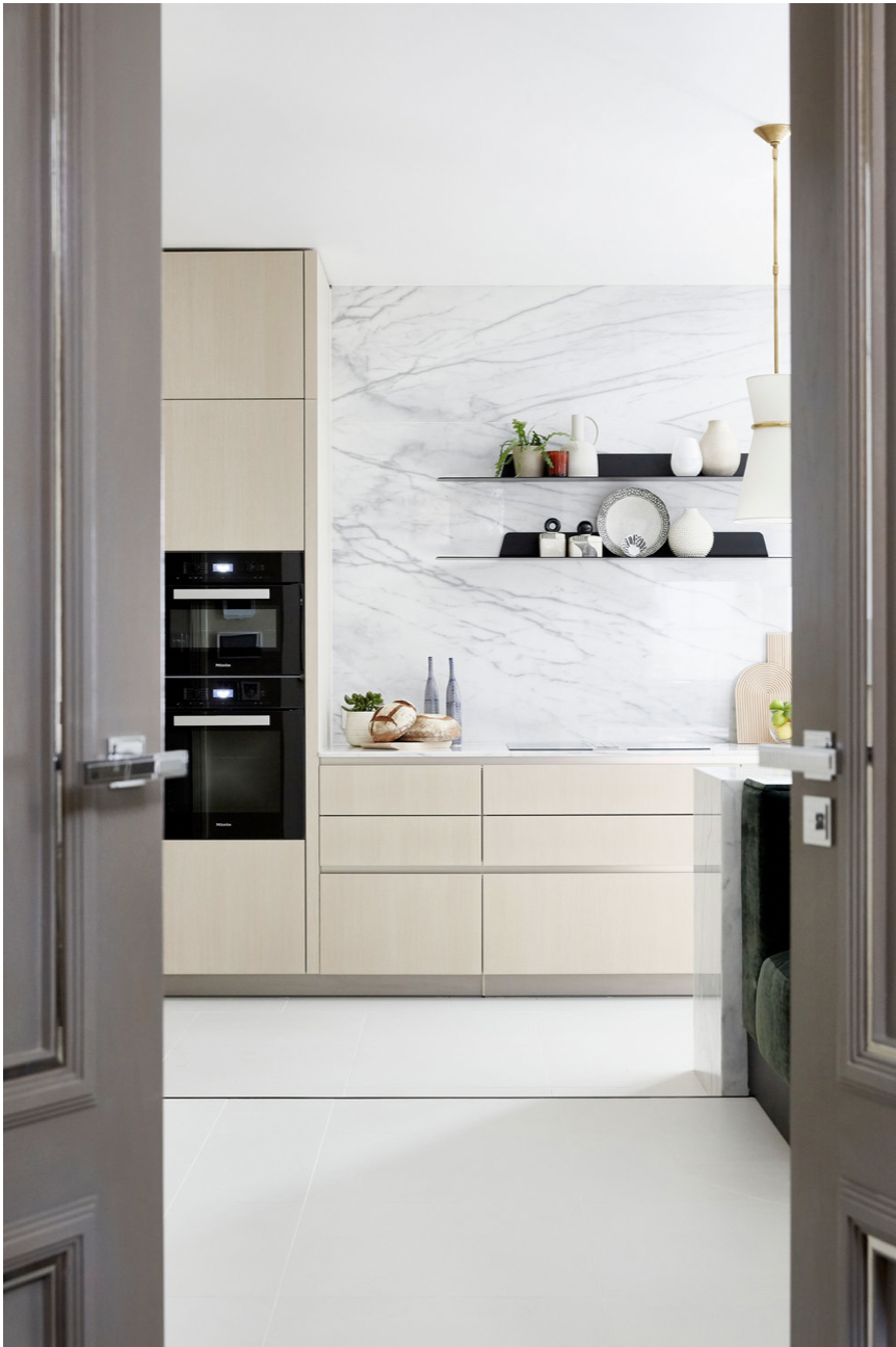
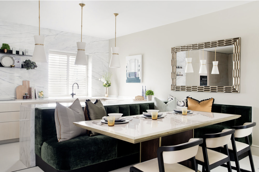
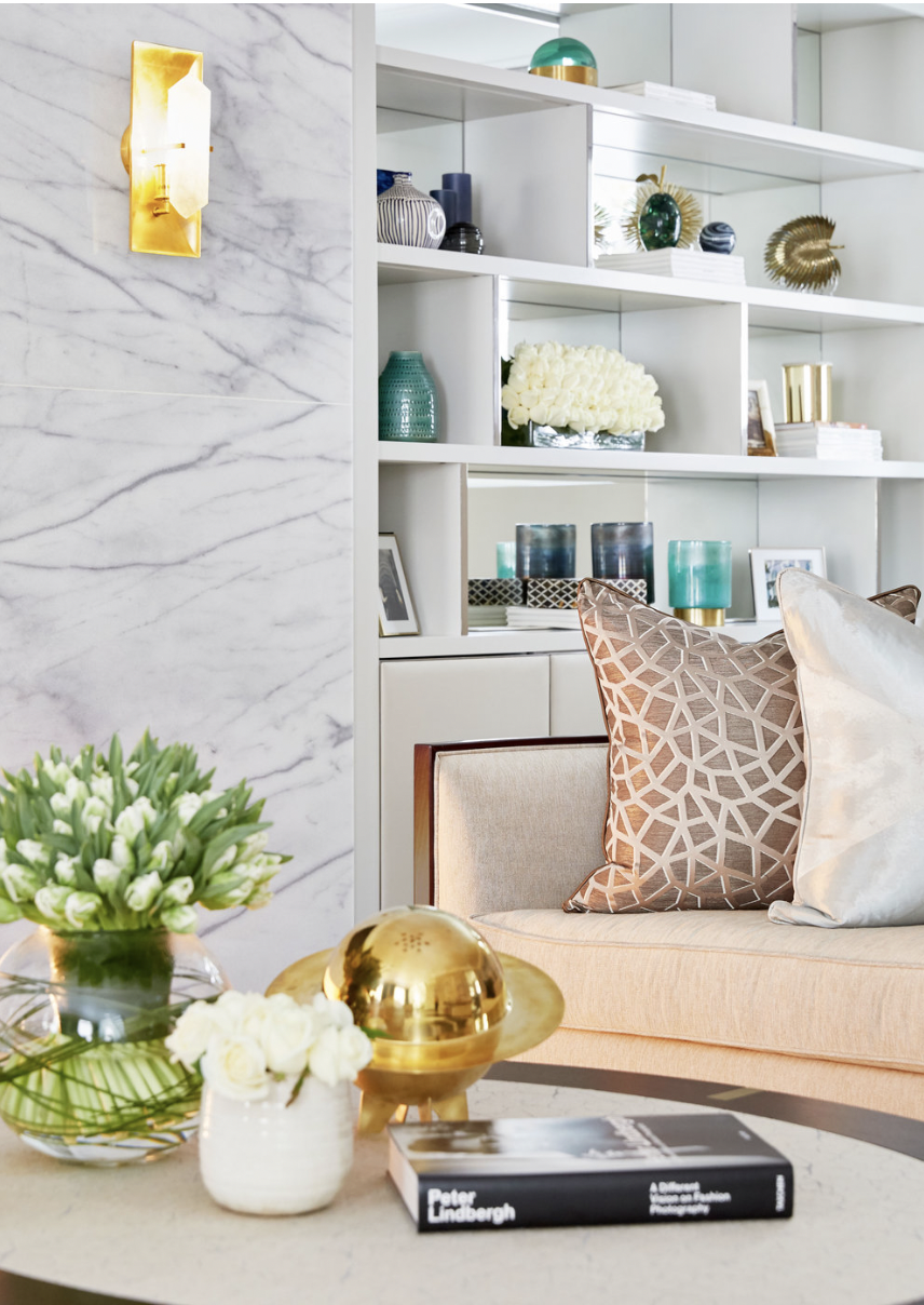
Take a look at our Little Chester Street Home Staging project for example, which features rich shades of orange, deep blues and warm woods. Paired with cool toned areas such as the kitchen, dining table and plants - this project is a perfect harmony of the two.
The Serenity of Cool Colours:
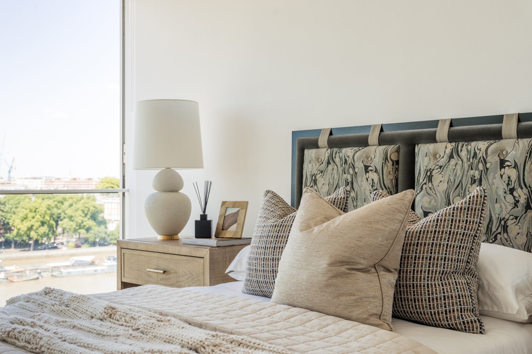
Cool colours are known for their soothing and calming effects. Blue, often associated with tranquillity and serenity, is ideal for bedrooms or spaces where relaxation is paramount. Green, reminiscent of nature, promotes a sense of balance, harmony, and renewal, making it perfect for living rooms or areas designated for meditation and rejuvenation. Purple, with its regal and introspective qualities, can be used in bedrooms or cosy reading nooks to create an atmosphere of luxury and introspection.
Our Boscobel Place portfolio is a wonderful example of using cool tones and colours to make a place feel calm, inviting and balanced. The earthy, green tones throughout the property draw you in, creating a beautiful family haven inspired by nature.
The Neutral Palette:
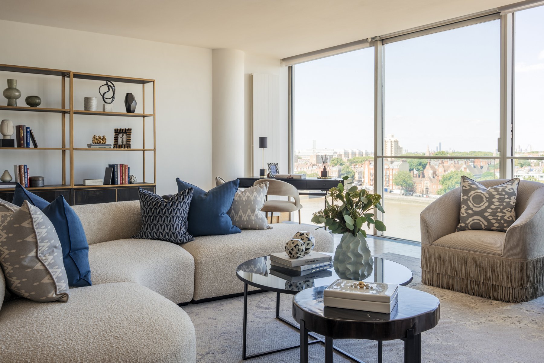
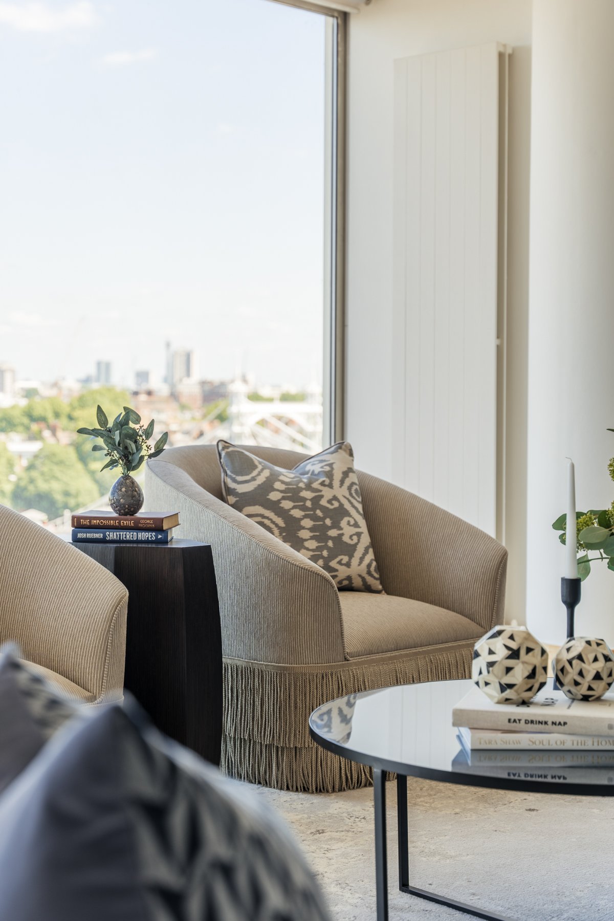
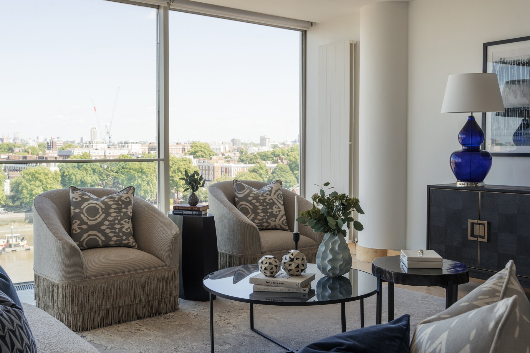
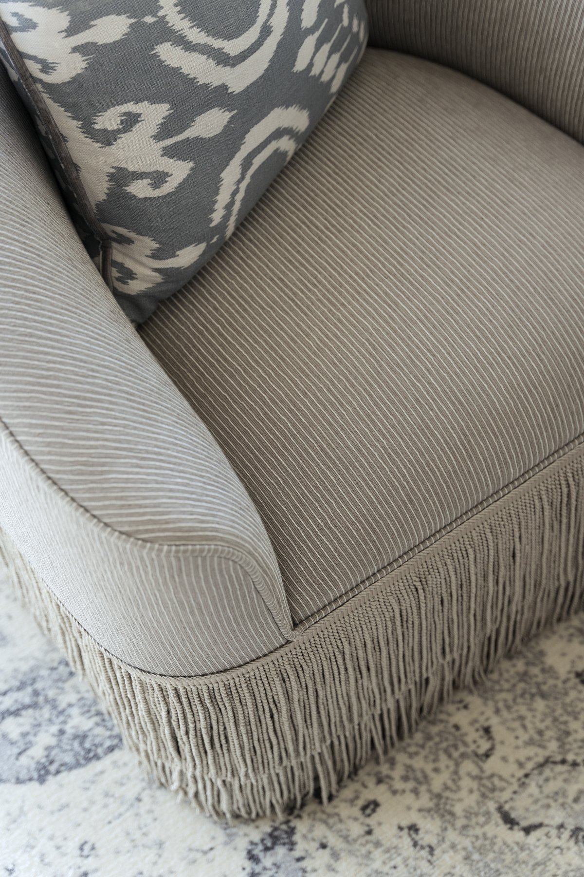
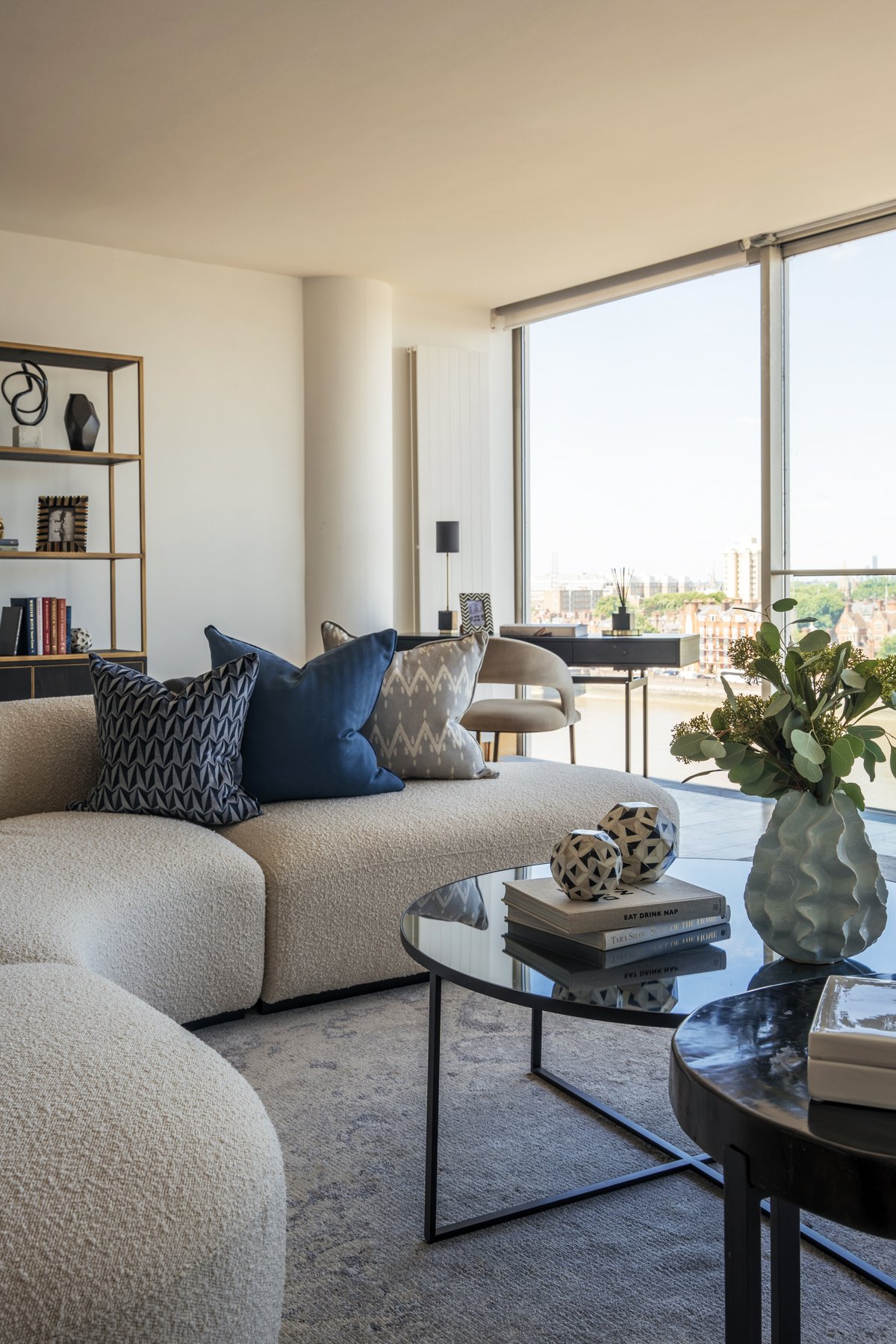
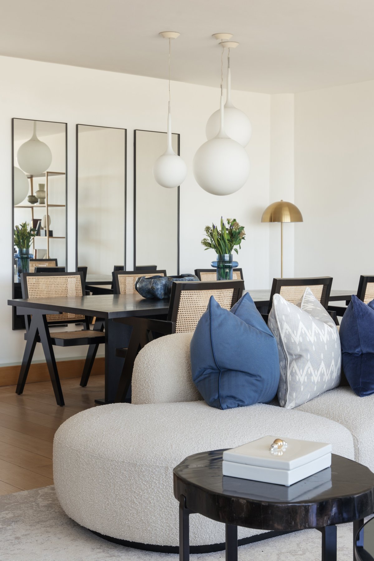
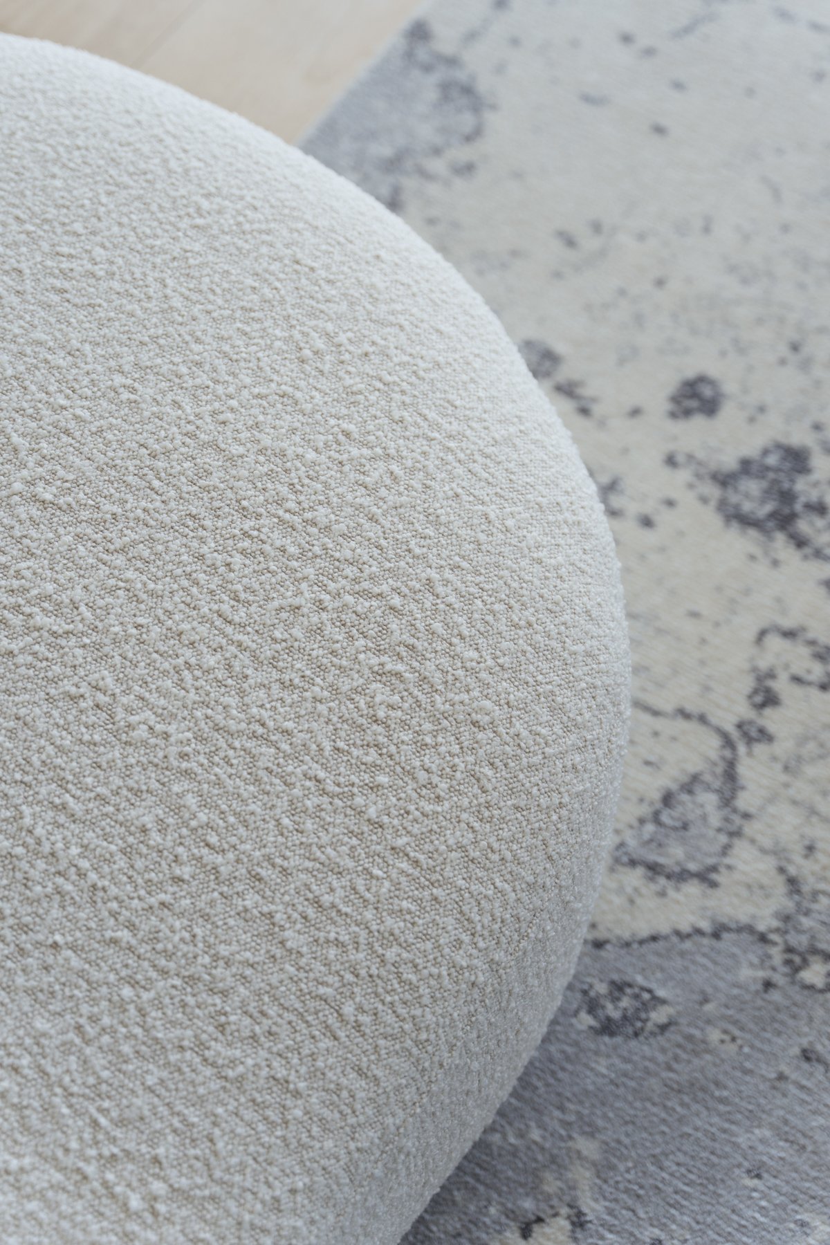
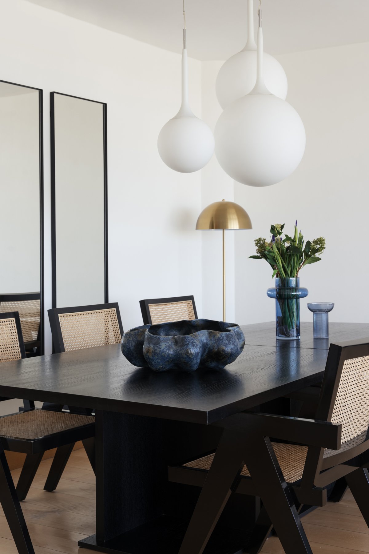
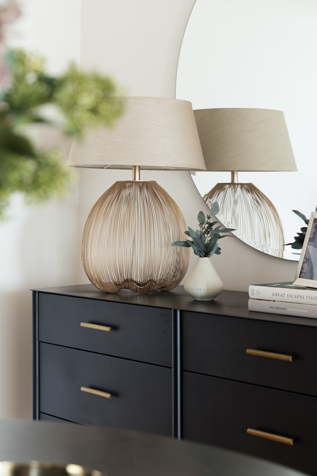
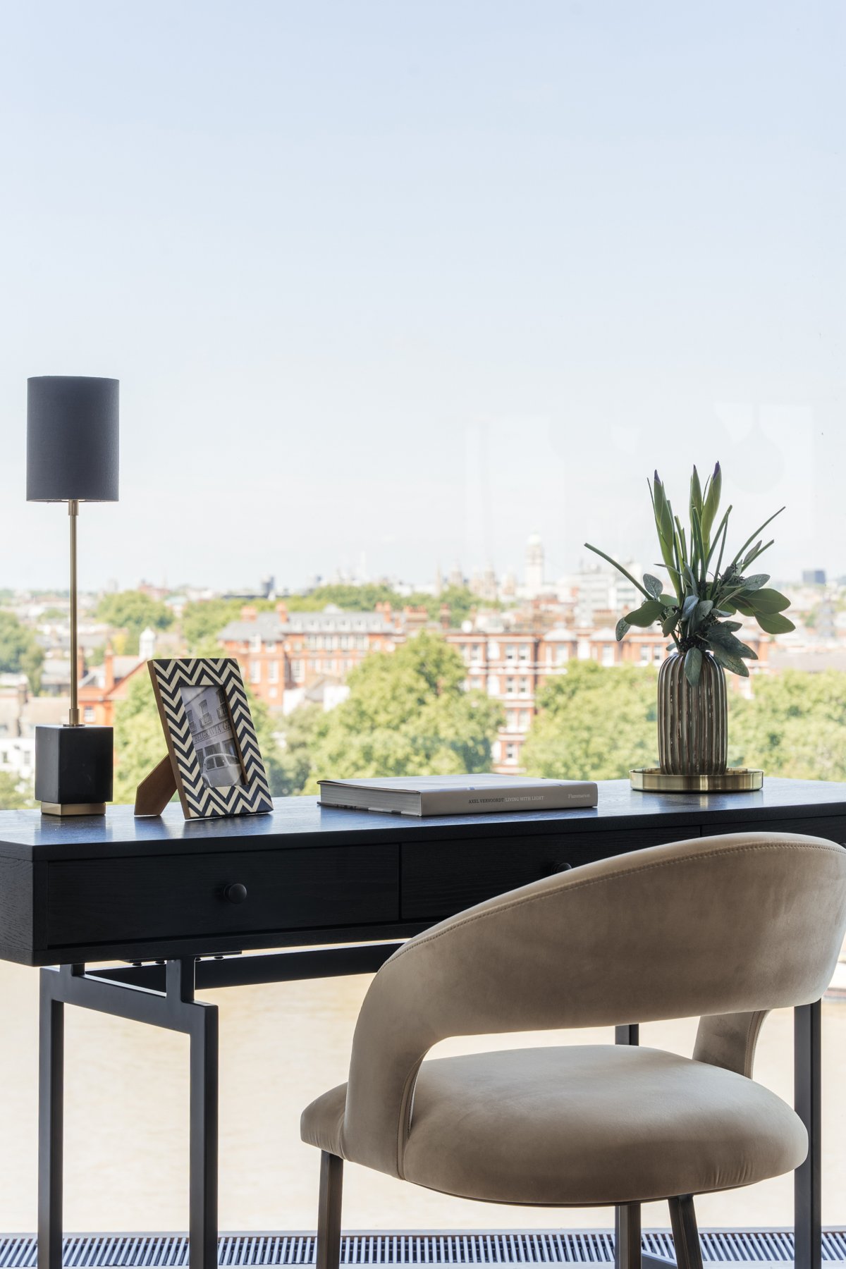
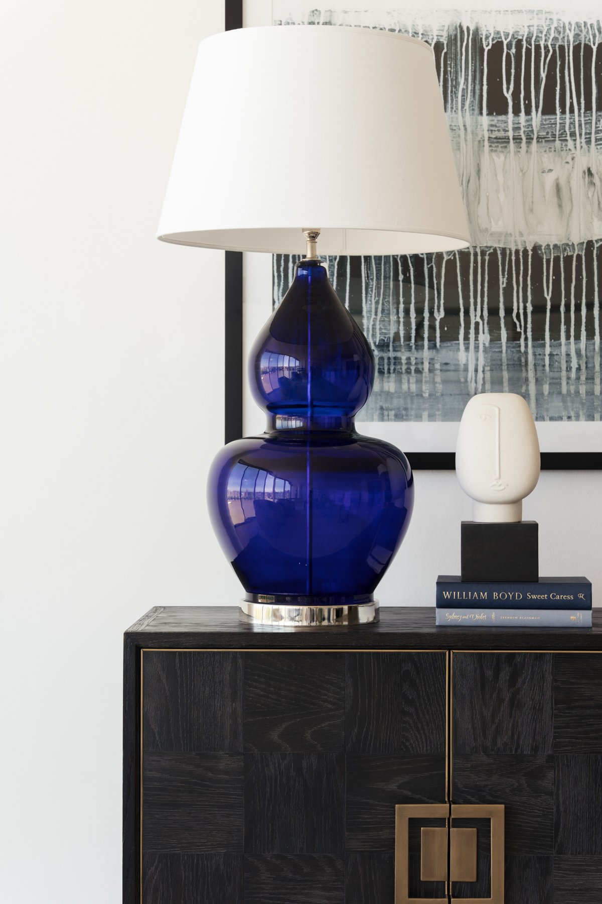
Neutral colours, such as white, beige, and grey, offer a versatile canvas for any interior design style. While they may not possess strong emotional associations like other colours, they can create a sense of peace and cleanliness. Neutrals are particularly useful in smaller spaces, as they visually expand the room and allow other elements, such as furniture or artwork, to take centre stage. Our Riverside One project represents the use of neutrals in a way which reflects the incredible surroundings of the property, and the additional pops of blue keep it from appearing almost flat.
Balancing and Combining Colours:
Finding the right balance of colours is essential for achieving a cohesive and harmonious living space. Consider using complementary colours, which are opposite each other on the colour wheel, to create a dynamic and visually pleasing environment. For instance, pair cool blues with warm oranges or purples with yellows to add depth and interest. Additionally, consider the intensity and saturation of the colours you choose, as lighter shades can create an airy and spacious feel, while darker hues can add richness and intimacy.
Colour has the incredible power to transform a living space, influence our emotions, and enhance our overall well-being. By understanding the principles of colour psychology, you can intentionally choose colours that align with your desired ambiance and create a home that nurtures and uplifts you. Experiment with different hues, tones, and combinations to craft a living space that truly reflects your personality, while also creating a sanctuary that supports your emotional needs.
Remember, the beauty of colour psychology lies in its subjectivity, so trust your instincts and choose colours that resonate with you. Whether you opt for vibrant and energising tones or soothing and serene hues, let the power of colour guide you in creating a space that brings you joy and contentment every time you walk through the door.
Want to refresh your property this summer? Create your dream home with our personalised luxury interior design service.